


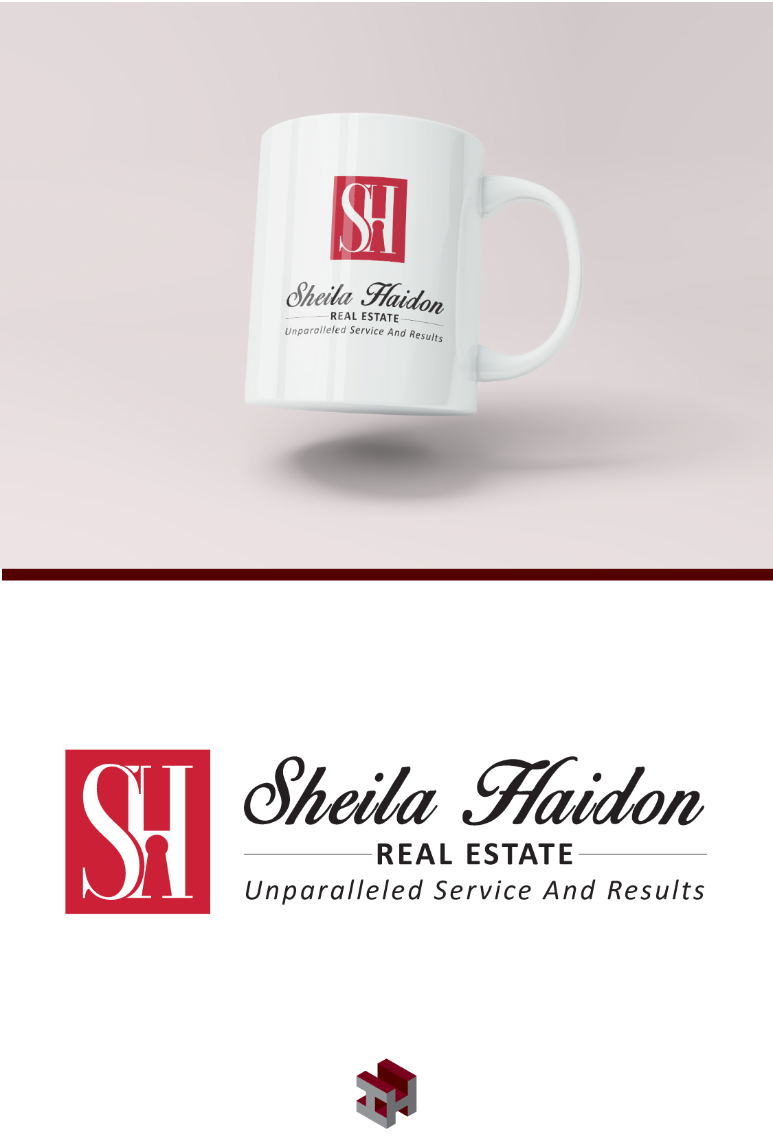
Sheila Haidon Logo Design
We worked with Sheila Haidon on a logo design that is sophisticated, professional and encompasses credibility, honesty and humbleness. The keyhole at the base of the H represents the answer to real estate goals. The red is aligned with her brokerage Keller Williams Realty, and adds to the sophistication while keeping it vibrant and recognizable…