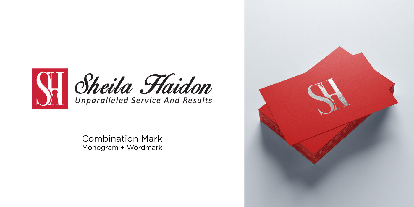
We worked with Sheila Haidon to create a logo design that is sophisticated, professional and encompasses credibility, honesty and humbleness.
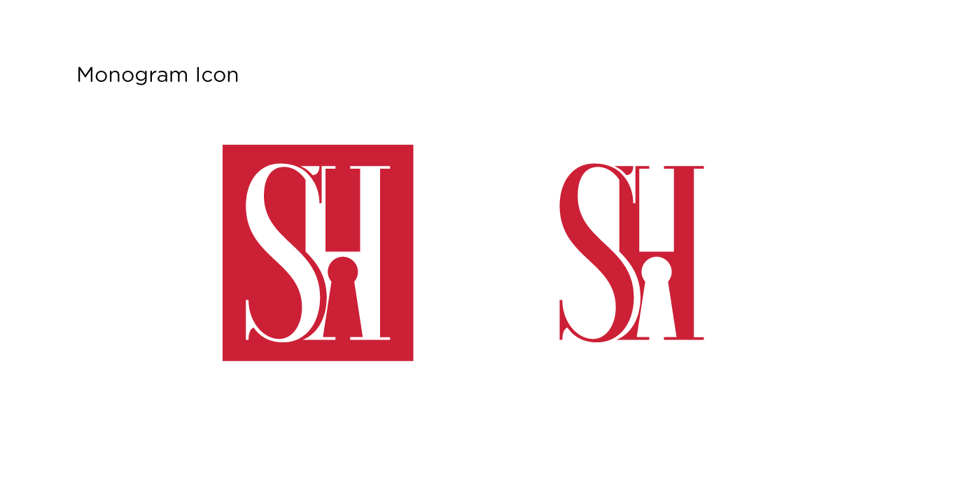
The logo suite consists of an icon that can appear separately from the wordmark, and within a rectangular shape or outside with just the simple letter forms. This flexibility and versatility is strongly represented in Sheila’s approach to real estate and it was equally important for the logo to reflect the same.


