Logo Design & Brand Identity Reports / Annual Reports
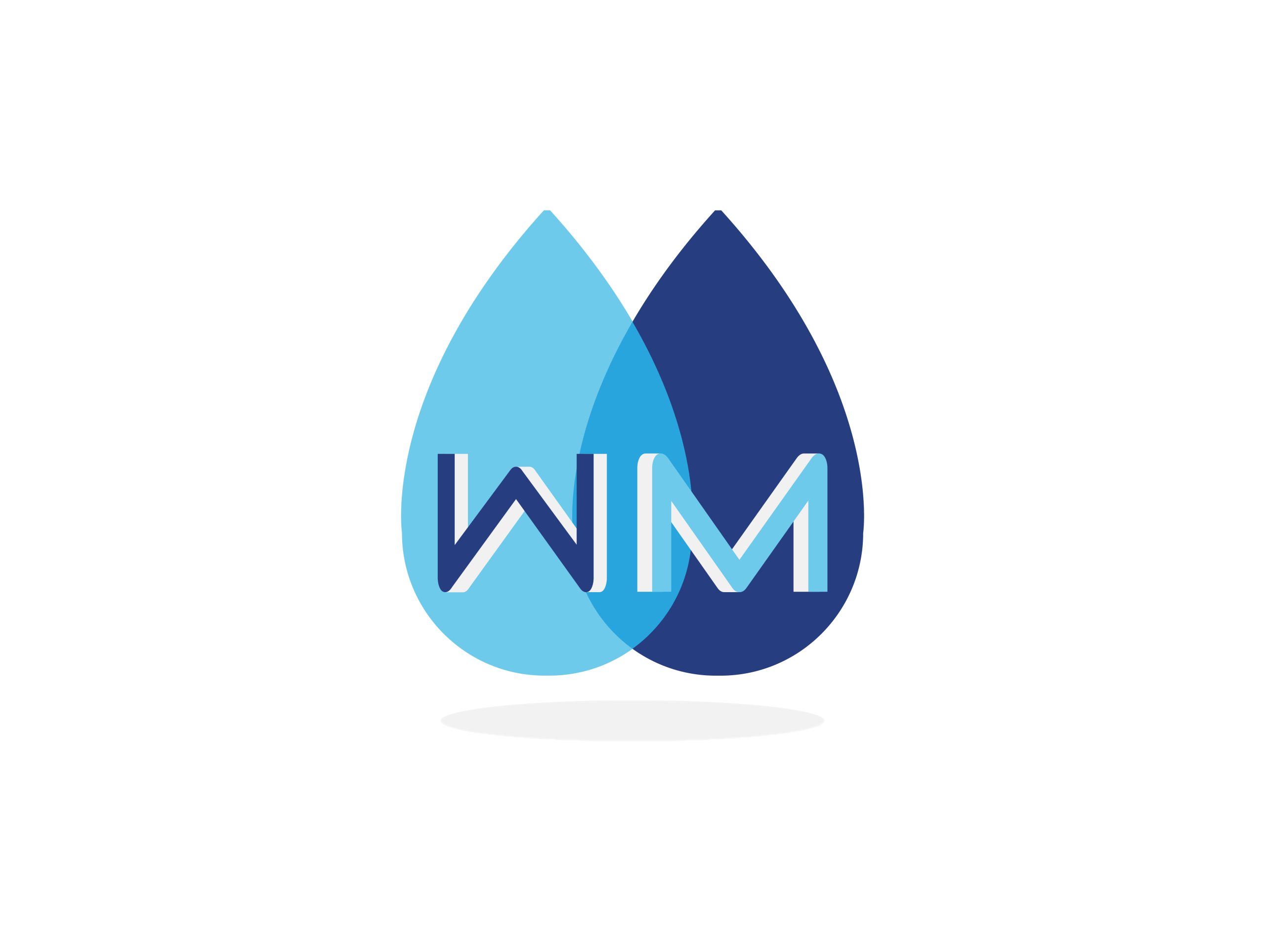
The Water Market | Logo Design 2018 A water solutions business that aims to address every issue and concern and deliver the most appropriate and efficient solution to any water quality problem. Wanting an updated look from their previous logo that could easily stand out and apply across various materials from apparel to signage, the…
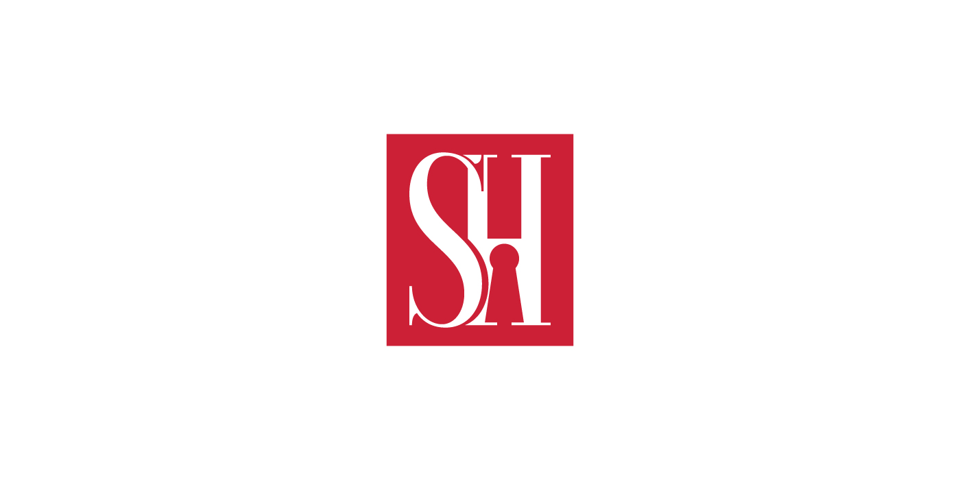
We worked with Sheila Haidon to create a logo design that is sophisticated, professional and encompasses credibility, honesty and humbleness. The logo suite consists of an icon that can appear separately from the wordmark, and within a rectangular shape or outside with just the simple letter forms. This flexibility and versatility is strongly represented in…
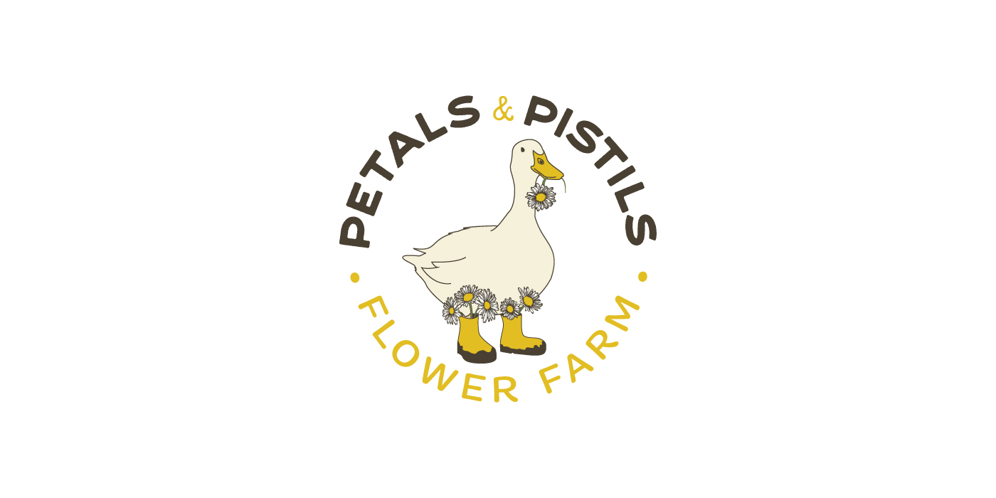
The goal for this logo design aimed for an illustrative and rural feel to represent a flower farm, located in Severn Bridge. Offering fresh cut flower bouquets using organic fertilizers, dirt, water and sunshine. The key phrases that encompass the design strategy are, “a worn pair of muddy boots”, “fresh cut wild flowers”, “a lived-in…
