The goal for this logo design aimed for an illustrative and rural feel to represent a flower farm, located in Severn Bridge. Offering fresh cut flower bouquets using organic fertilizers, dirt, water and sunshine. The key phrases that encompass the design strategy are, “a worn pair of muddy boots”, “fresh cut wild flowers”, “a lived-in rustic farm” and a fond and cherished memory of the two Peking ducks that freely wandered the farm like family.
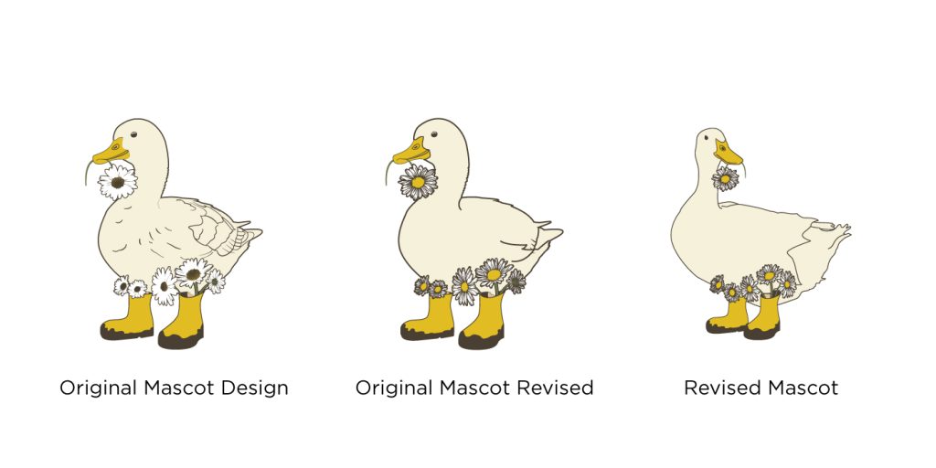
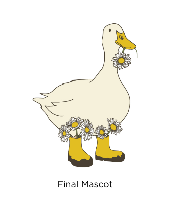
The mascot is an important piece of the logo and brand identity. It is important that the story, characteristics and personality of the ducks were properly represented. The process from the initial mascot to the final mascot took two to four weeks to allow time between iterations to reflect on the overall detail and scalability of the logo.
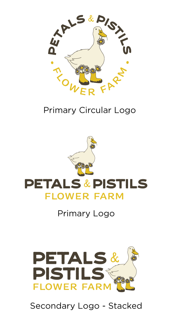
The logo has a variety of options from circular shape as the primary logo, a centered horizonal version and a secondary stacked logo, while the mascot can also be used on its own for brand repetition on items where the wordmark already appears. These options offer flexibility and creativity with the logo placements.
The colour palette has been chosen to reflect the outdoors and rural farm landscape with a rich yellow and deep brown.
